content
 Introduction
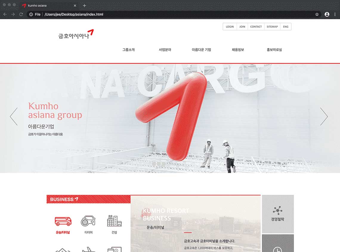
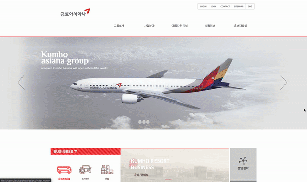
The previous Kumho Asiana homepage was a website optimized for resolution 1020px only. So I rebuilt a website that responds to various devices (pc, mobile, tablet) regardless of the environment of the users. Also I didn’t intend to rely on Open Source for implementing the necessary functions of the website. 기존 금호아시아나 홈페이지는 해상도 1020px에만 최적화 되어 있는 웹사이트였습니다. 새로 제작된 사이트는 다양한 이용자의 환경에 상관없이 다양한환경(pc, mobile, tablet)을 대응하며, 오픈소스에 의존하지 않고 웹사이트에 필요한 기능들을 구현시켰습니다.
The final goal: 1. Completed with cross-browsing, web accessibility 24 items, and mark-up. 2. Created JQuery and JavaScript code without plug-ins. 3. Implemented PHP Web space using DB. 최종목표: 1. 마크업 및 웹접근성 24가지 항목, 크로스브라우징 적용완료. 2. 플러그인 없이 제이쿼리 및 자바스크립트 직접 코드 작성. 3. DB를 이용한 PHP웹공간 구현.
-
 Work period
작업기간
Dec.2015 - Feb.2016
Work period
작업기간
Dec.2015 - Feb.2016
-
 Contribution
참여도
Design 100%, HTML+CSS 100%, jQuery 90%, Javascript(Front) 60%, Php 50%
Contribution
참여도
Design 100%, HTML+CSS 100%, jQuery 90%, Javascript(Front) 60%, Php 50%
-
 Program for use
사용프로그램
Bracket, Browser(ie7~11, Chrome, Firefox, Safari) Kwah4.0, CCA, Juicy Studio Accessibilty, Jquery, Javascript, Apmsetup, Php, Photoshop, Illustrator
Program for use
사용프로그램
Bracket, Browser(ie7~11, Chrome, Firefox, Safari) Kwah4.0, CCA, Juicy Studio Accessibilty, Jquery, Javascript, Apmsetup, Php, Photoshop, Illustrator
-
 Tag
키워드
CSS, HTML, jQuery, Javascript, reacive Web, Web Design
Tag
키워드
CSS, HTML, jQuery, Javascript, reacive Web, Web Design
Why are you making 'Responsive Web sites'? 반응형 웹을 만드는 이유
Fifty percent of my portfolio sites are Responsive Web. Responsive Web is a website that responds to all screen pixels with a single URL without a mobile separate site. One advantage is that developers don't have to mange each server. On the other hand, a disadvantage is that I have to design and code to respond to all resolutions. And professional skills on the Responsive Web should be supported. The decision to create a mobile separate site or a Responsive Web should be made according to the planning stage or the characteristics of the homepage. There is no definite answer here. But I prefer a responsive web that is easier to read at all resolutions, even if it takes a little longer to build and it's tricky to build. 제 포트폴리오의 절반 정도가 반응형 웹을 포함하고 있습니다. 반응형 웹은 모바일 별도 사이트 없이 하나의 URL로 모든 해상도에 반응하는 웹사이트 입니다. 때문에 개발자들이 서버를 각각 관리해야 할 필요가 없다는 장점이 있습니다. 대신 모든 해상도에 반응하도록 디자인하고 코드를 만들어야 한다는 단점이 있습니다. 또한 반응형 웹에 대한 전문적인 스킬이 뒷받침 해주어야 할 것입니다. 모바일 별도사이트를 만들지, 또는 반응형 웹을 만들지는 기획단계나 홈페이지의 특성에 맞게 정해져야 합니다. 확실한 정답은 없지만, 제작시 시간이 조금 더 걸리고 제작하는게 까다롭더라도 저는 모든 해상도에서 읽기가 편한 반응형 웹을 선호합니다.

Point
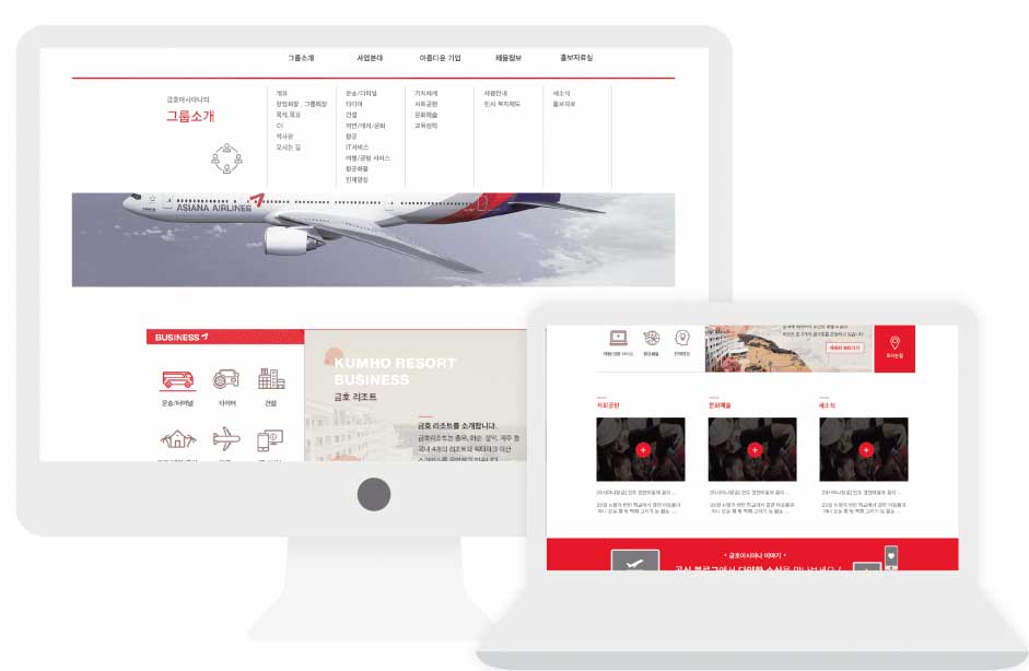

- PCPC
- 해상도 1600px 이상 PC화면 / 해상도 1024px 이상 PC화면 PC screens with a resolution of 1600 px or higher / PC screen with a resolution 1024px or higher
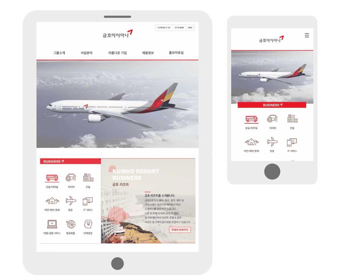
- MOBILE & TABLET PC모바일 & 태블릿 PC
- 해상도 480px 이상 MOBILE 화면 / 해상도 768px 이상 TABLET 화면 MOBILE screen with a resolution 480px or higher / TABLET screen with a resolution 768px or higher
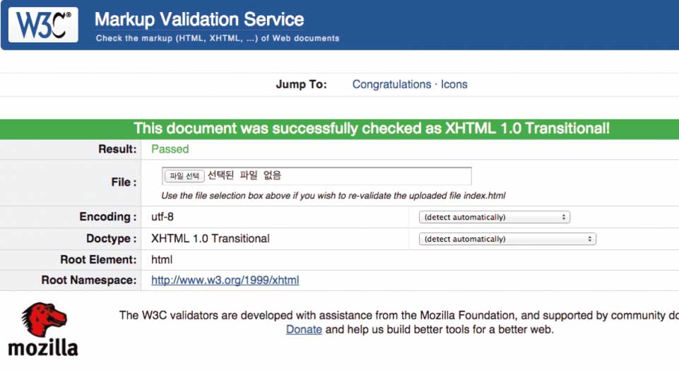
- Web standard웹표준
- Validater 유효성검사, HTML5 Outline 통과 ! mark-up 유효성검사를 통해 웹표준을 준수하였음을 검증할 수 있었으며, 이를 통해 튼튼한 마크업을 확인할 수 있습니다. Validator validation, and HTML5 Outline Test passed! Validation of the mark-up has shown compliance with web standards. This step ensured a strong mark-up.
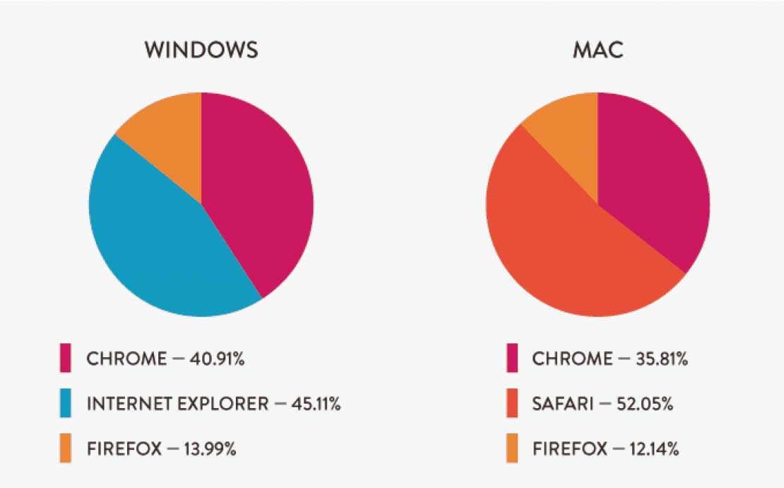
- Cross-Browsing 1크로스브라우징 1
- OS에 따른 브라우저 사용 그래프: 윈도우사용자의 40.91%가 크롬을 사용하며, 맥 사용자의 35.81%가 크롬을 사용하는 것으로. 두 운영체제 모두 크롬브라우저 사용률이 제일 많은 것으로 드러났습니다. 이제는 인터넷 익스플로러 보다 크롬을 더 많이 사용하며, 다양한 브라우저의 등장으로 그에 맞추어 이용자의 선호하는 브라우저에서 동일한 화면으로 볼 수 있도록 합니다. Browser Usage Graph: 40.91% of Windows users use Chrome, and 35.81% of Mac users use Chrome. Both operating systems were found to have the highest usage of chrome browsers. Now, we use more Chrome than Internet Explorer, and with the advent of various browsers, we can see the same result whatever preferred browser we use.
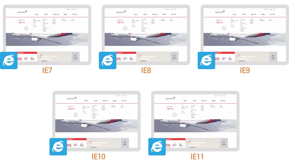
- Cross-Browsing 2크로스브라우징 2
- 인터넷 익스플로러: 각각의 css 파일분리로 가독성을 높였습니다. 브라우저 별로 맞춘 css 파일 링크 Internet Explorer: File separation: Each CSS file separation increased readability. Each CSS file was linked to minimize errors by specific browsers. The same results were found in various IE versions.
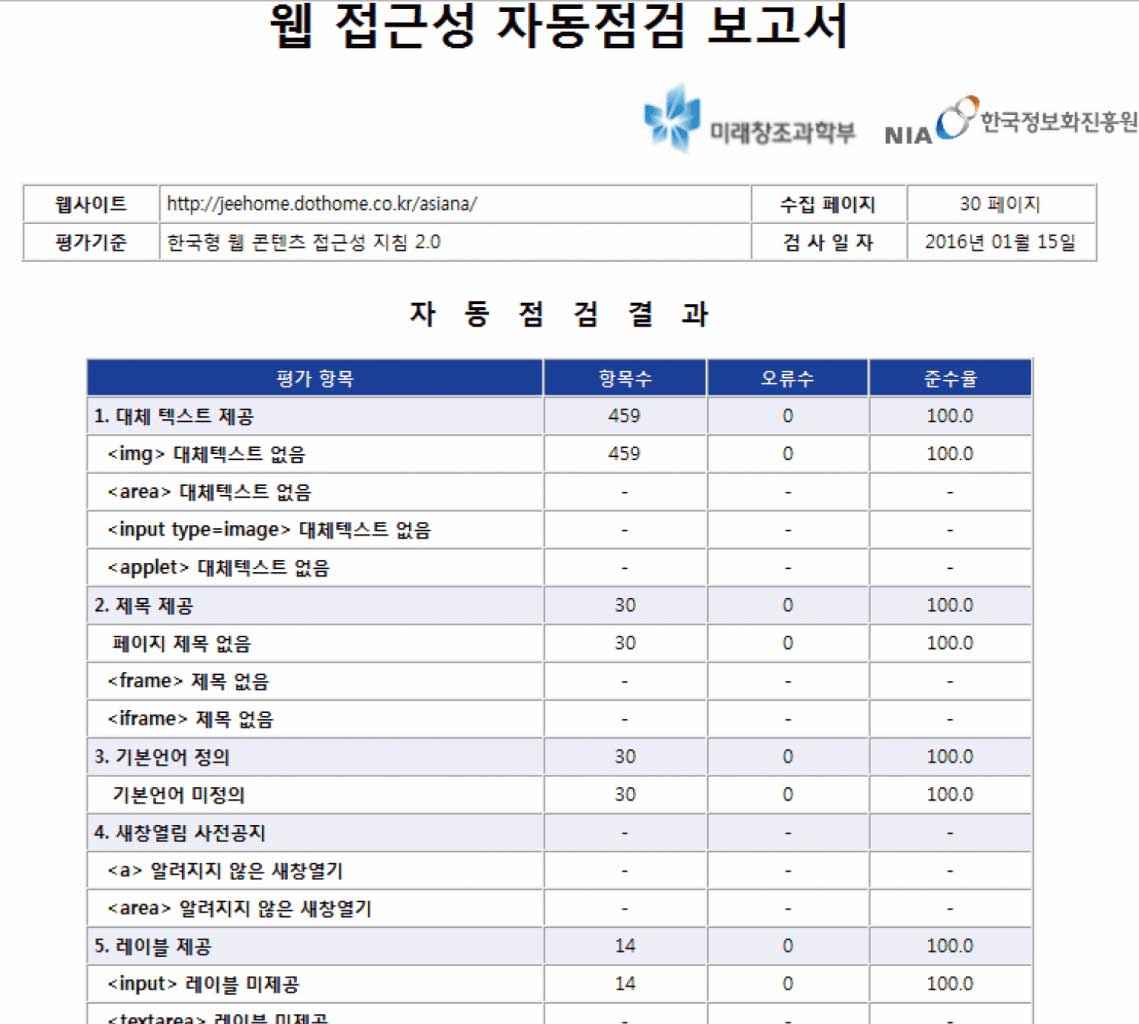
- Web Accessibility웹접근성
- 웹 접근성 자동점검 보고서 100% 준수 100% compliance with web accessibility auto-check reports
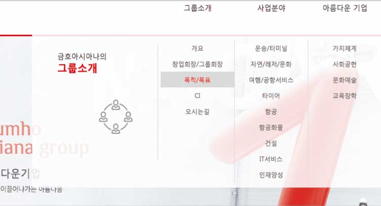
- JS 1: GNB Menu SlideJS 1: GNB 메뉴 슬라이드
- 메뉴부분에 마우스를 가져다 되면 세부 메뉴가 슬라이딩 효과로 펼쳐지게 하였습니다. When you bring the mouse to the menu, the detailed menu expands with a sliding effect.
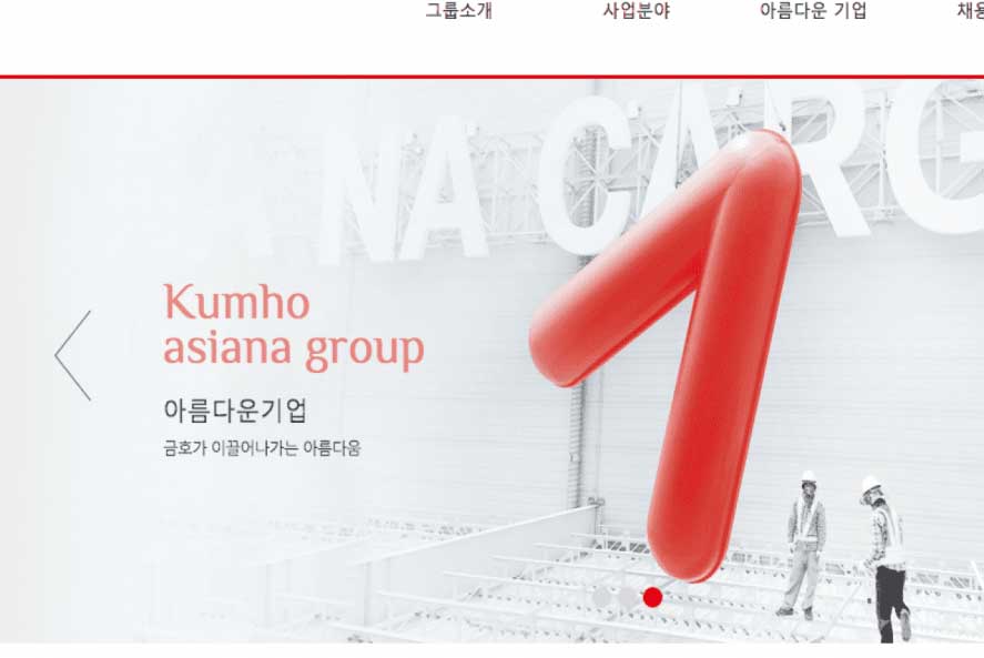
- JS 2: Main Visual SectionJS 2: 메인비주얼
- swipe기능으로 움직임만으로 이미지가 슬라이딩 되며, 타이머기능을 넣어 정해진 시간마다 롤링되게 하였습니다. 또한 각 방향키와 버튼으로 조작 가능하게 하였습니다. The image is sliding with the swipe function, and the timer function is performed to slide at a specified time. It is also possible to operate with each direction key and button.

- JS 3: Sub-Visual Tab MenuJS 3: 서브비주얼 탭메뉴
- 아이콘에 마우스를 가져다 되면 컬러가 바뀌고, 아이콘을 클릭하면 해당 Tab메뉴 내용이 보여지게 만들었습니다. PC, TABLET 화면에서 적용되고, MOBILE환경에서는 사용성을 고려하여 바로 해당 페이지로 연결하였습니다. When you move your mouse over an icon, the color changes. And when you click the icon, you can see the contents of the tab menu on the PC and TABLET screens. Otherwise, in the MOBILE environment, the page is directly linked for usability considerations.
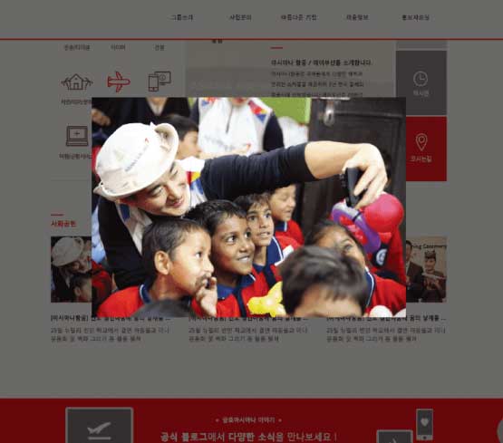
- JS 4: Gallery modalJS 4: 갤러리 modal
- 아이콘에 마우스를 가져다 되면 (+)모양의 확대 보기 버튼이 생기고 버튼을 클릭하면 전체 이미지가 보이도록 modal기능을 구현하였습니다. When you bring the mouse to the icon, you will get a zoom button and you can click the button to display the entire image.
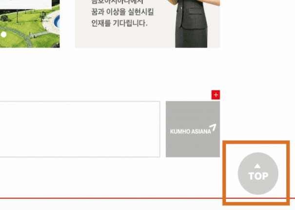
- JS 5: TOP buttonJS 5: TOP버튼
- 하단부 버튼을 클릭하면 해당하는 내용이 보여지는 슬라이딩 메뉴입니다. animate 효과를 이용하여 구현되었습니다. (pc1 버전에서만 보이도록 제작하였습니다.) TOP 버튼을 클릭하면 맨 위 상단으로 올라가게 만들었습니다. This is a sliding menu that shows the corresponding contents when you click the bottom button. It was implemented using animate effect. (It's designed to be visible only in the pc1 version.) Click the TOP button to go up to the top.
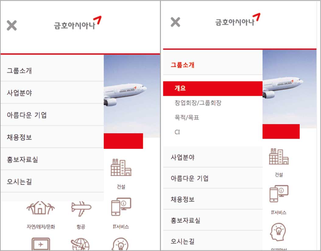
- JS 6: Mobile GNB MenuJS 6: 모바일 GNB 메뉴
- 상단 메뉴 버튼을 클릭하면 메뉴가 슬라이딩되어 나오며 해당 메뉴를 클릭하면 하위메뉴가 부드럽게 펼쳐지도록 하였습니다. 아코디언을 이용하여 구현하였습니다. Mobile GNB Menu: When you click the top menu button, the menu slides out. When you click on the menu, the submenu is spread out smoothly. It was implemented using an accordion.
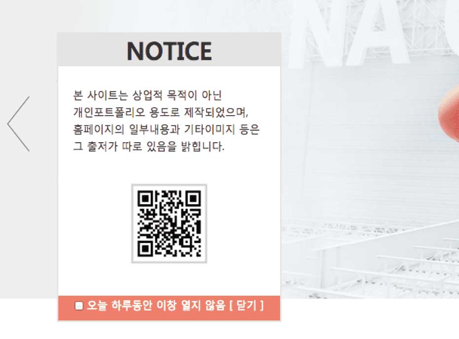
- JS 7: Pop-upJS 7: 팝업
- 팝업창을 제작하였습니다. 하단에 체크박스에 체크를 하면 쿠키로 인해서 하루동안 팝업창이 다시 열리지 않습니다. I made a pop-up window. If you check the box at the bottom, the pop-up window will not open again for one day due to cookies.
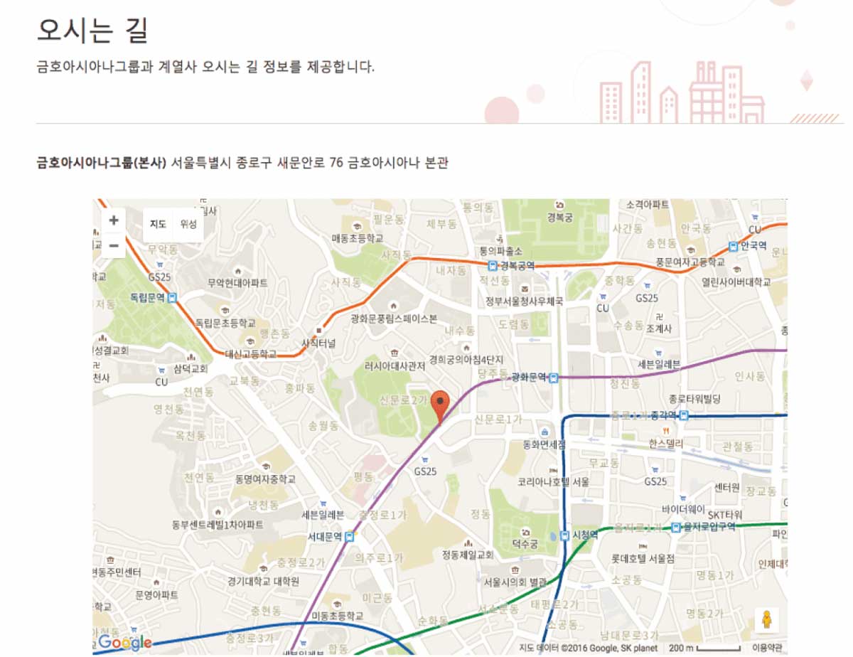
- JS 8: MapsJS 8: 지도
- gmap을 이용하여 지도표시가 되도록 하였습니다. Gmap was used to see maps.
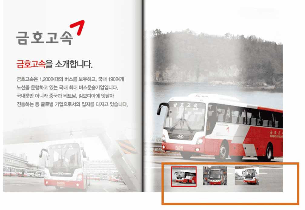
- JS 9: Gallery-type effectJS 9: 갤러리 형태의 효과
- 썸네일 이미지를 클릭하면 오른쪽 이미지가 서서히 해당하는 이미지로 변화합니다. When you click on the thumbnail image, the image on the right slowly changes to the connected image.
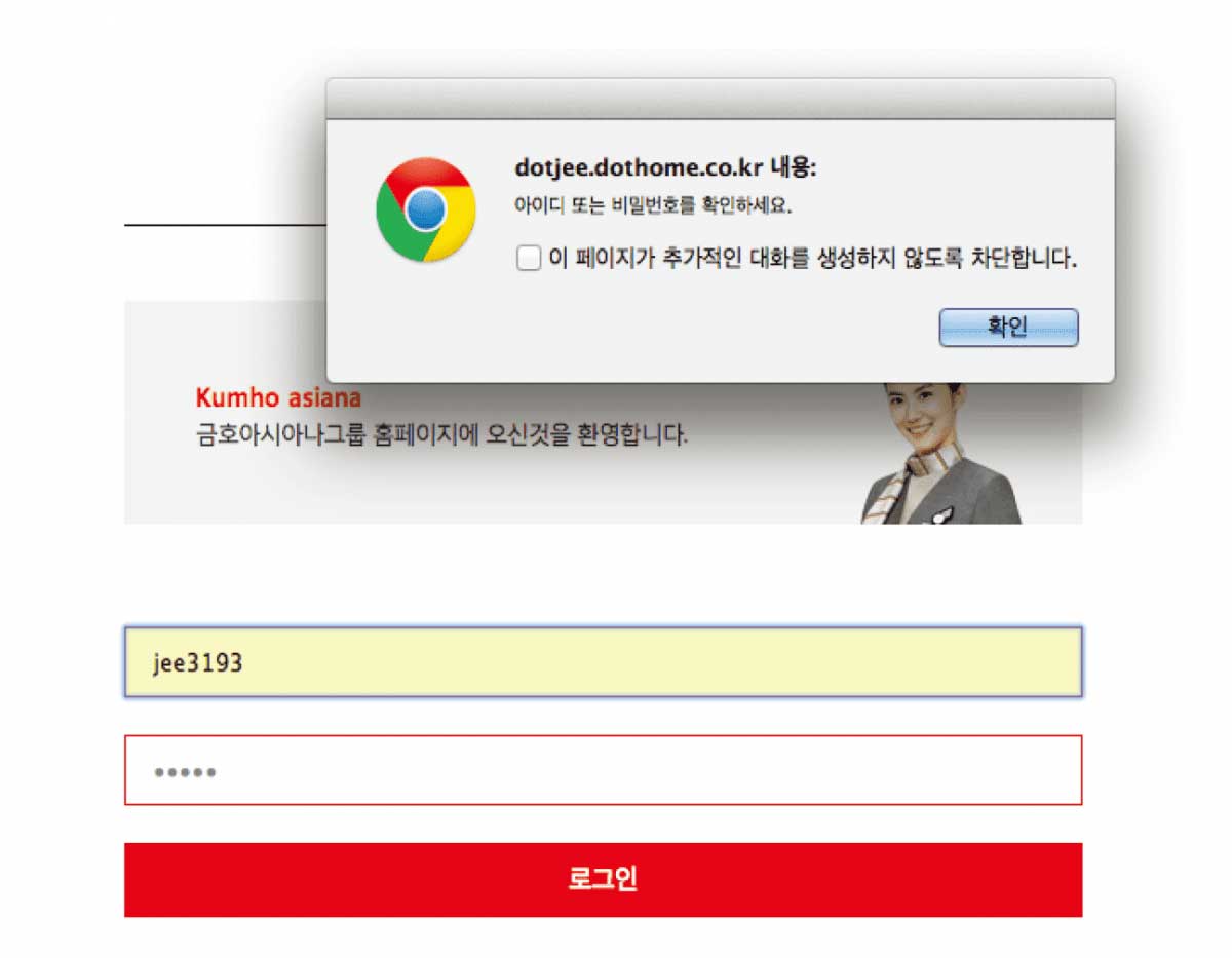
- PHP 1: Login / MembershipPHP 1: 로그인 / 멤버십
- 가입했던 아이디는 DB에 저장되어 로그인이 가능합니다. 로그인 페이지 : 로그인페이지 유효성 검사가 되도록 하였습니다. 회원가입 페이지 : 회원가입 페이지 유효성 검사가 되도록 하였습니다. Login page: The login page is validated.Member join page: The membership sign-up page is validated. The login page has been implemented using Php. Your subscribed ID is saved in the DB for login.
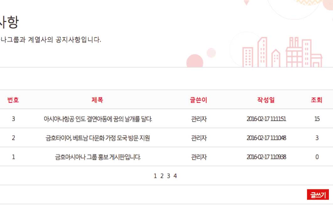
- PHP 2: BoardPHP 2: 게시판
- php로 게시판페이지를 구현하였습니다.해당 게시판을 클릭하면 내용으로 연결되며 [목록] [수정] [삭제] 페이지로 각각 이동됩니다. 또한 삭제, 수정 페이지수정페이지 글 작성시 입력했던 비밀번호와 동일해야 글 수정이 가능하도록 처리하였습니다. 해당 글을 삭제하려면, 글 작성시 입력했던 비밀번호를 입력해야 글이 삭제됩니다. The board page was implemented using Php. Click on its board to link to the content and move on to the [List] [Modify] [Delete] page. Also, The same password that you entered during the initial sign in should be identical to the one you entered to enable the modification of the text. To delete an article you wrote, you must enter the password you entered when you wrote it, to delete it.
- AJAX + CSV, XML and JSON AJAX + CSV, XML and JSON
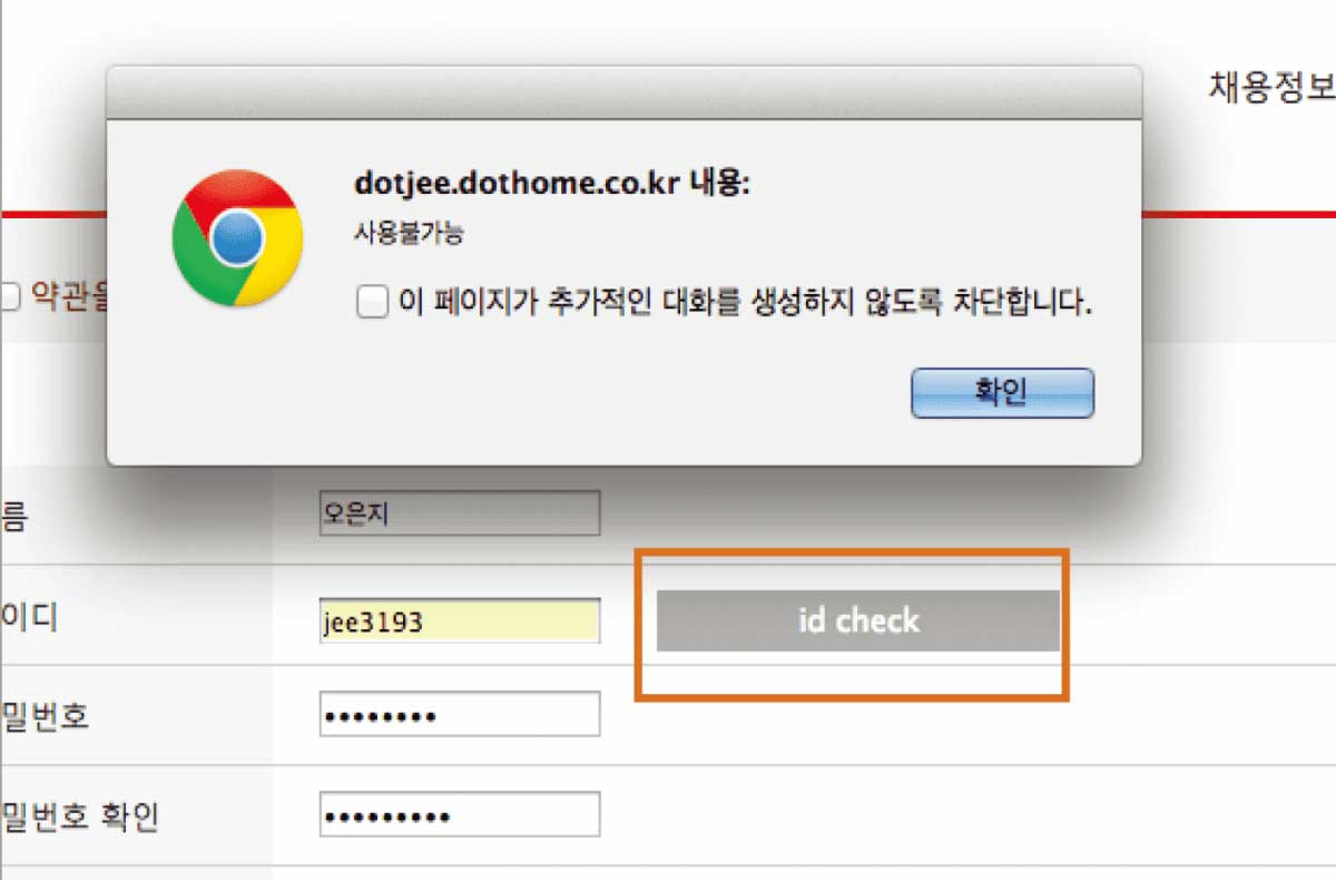
- 아이디 중복검사: 아이디 중복검사를 통해 바로 결과가 출력되도록 하였습니다. ID Duplicate Inspection: The results are derived immediately through ID redundancy testing.